From One-Bed Apartment To Family Home
The Brief
Our brief was to transform a one-bedroom Notting Hill house into an eclectic, art-filled, triple-storey family home with a calm palette of natural tones punctuated by splashes of bright colour and pattern. The design reflects the contemporary taste of the owners while incorporating Kitesgrove’s quietly luxurious aesthetic.
The Property
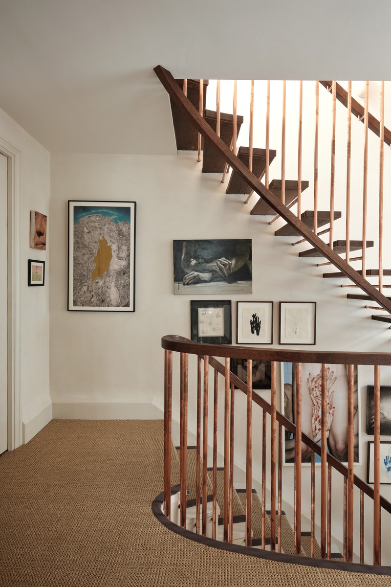
When the owners purchased the property, space was limited, consisting of only two floors and one large primary suite. Working with architects Studio McLeod, we were involved from the very beginning and informed all elements of interior design and architecture, reconfiguring the first floor to include not only the primary suite, but also two new children’s bedrooms as well as a family bathroom. We also added a third floor with two additional bedrooms and another bathroom as well as a playroom, WC, side hall and utility room on the ground floor. Due to the extensive reconfiguration, a complete interior refit was required, allowing us the freedom to introduce entirely new fixtures and fittings, from staircases and fireplaces to joinery, doors and windows.
TAKE THE TOUR
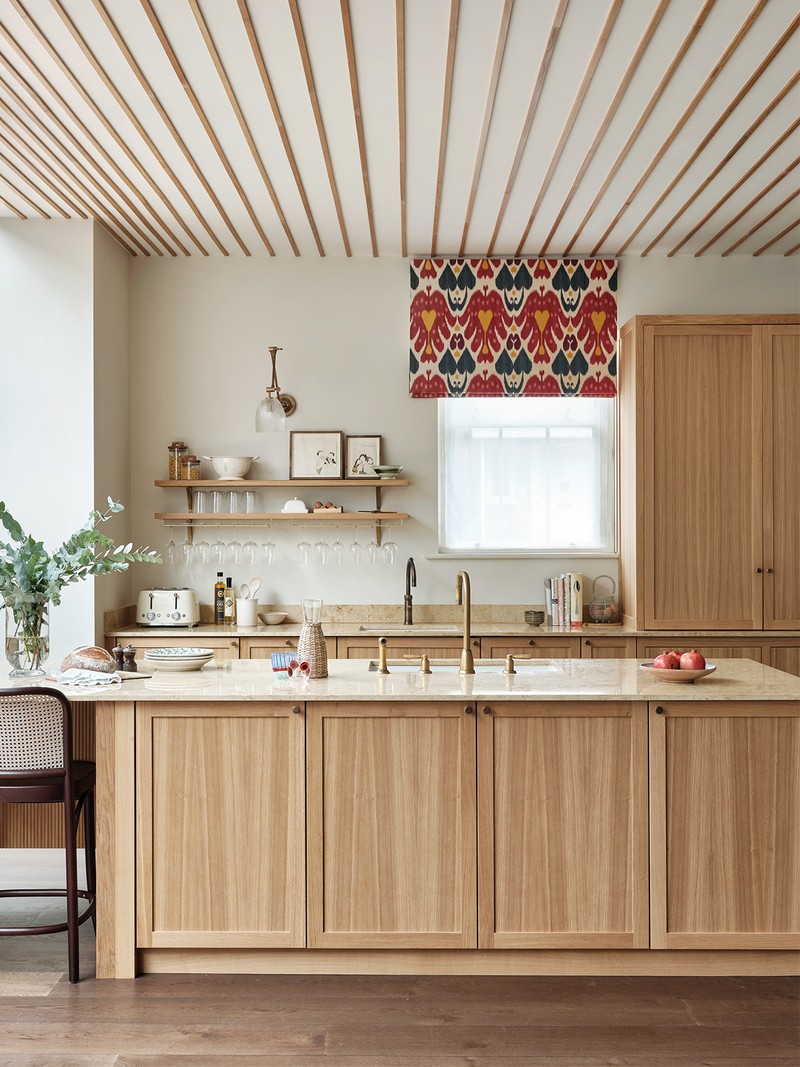
The Kitchen
The understated elegance of the timeless bespoke oak kitchen makes it a welcoming and calm place to spend time in. The kitchen island – one of the largest the team had ever designed – highlights the scale of the open-plan space. The team coordinated the natural oak of the cabinetry with the slatting details on the ceiling, creating a feature that defines the space while linking it visually with the adjoining living and dining areas.
/https%3A%2F%2Fsw18.sheerluxe.com%2Fsites%2Fslman%2Ffiles%2Farticles%2F2024%2F01%2Fkitchen-fb.png)
WALL PAINT: Paint And Paper Library
WALL LIGHT: Soho Home
ROMAN BLIND FABRIC: Pierre Frey
SANITARYWARE: Perrin & Rowe
BAR STOOLS: Dyke & Dean
Living Room
As the reception room, dining room and kitchen are all within the same space, balancing these areas – both in terms of scale and proportion – as well as allowing the client's artwork collection to be the main focus within the space, was an exciting challenge for the team.
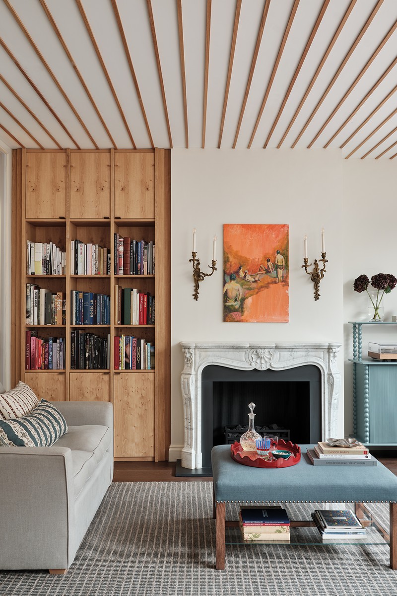
WALL PAINT: Paint And Paper Library
BAR UNIT: Alfred Newall
CUSHIONS: The Trove
RUG: Sibylle de Tavernost
SOFA, WALL LIGHTS & OTTOMAN*: Client's own
*Re-covered in fabric from Howe
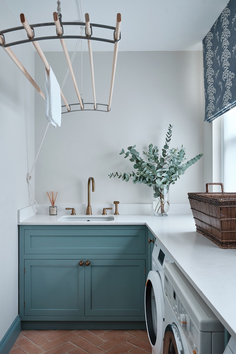
The Utility Room
Our client wanted this space to have the look and feel of a utility space typically found within the French countryside, reflecting their heritage and background.
CABINETRY COLOUR: Farrow & Ball
ROMAN BLIND FABRIC: Carolina Irving Textiles
TERRACOTTA FLOOR TILES: Bert & May
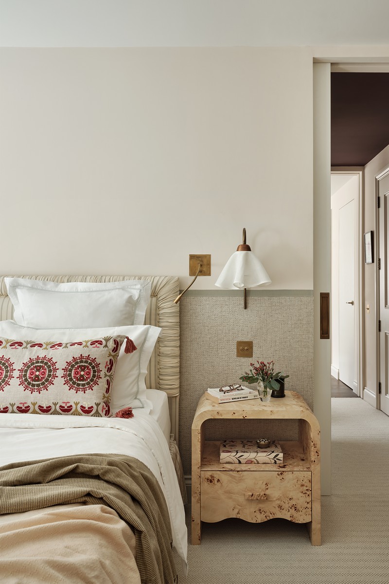
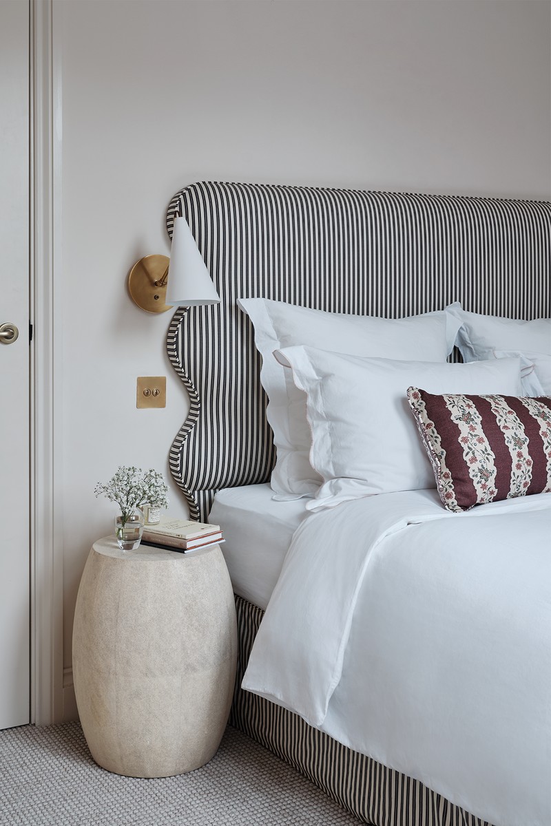
The Main Bedroom
The client's favourite colour is almond green, so using their existing headboard (and matching curtains, not pictured) as our starting point, we created a relaxing space filled with natural textures.
WALL PAINT: Edward Bulmer Paint
WALLPAPER: Colefax & Fowler
BEDSIDE TABLES: The Trove
BEDSIDE LIGHTS Fosbery Studio
BEDSIDE READING LIGHTS: Vaughan Designs
CUSHIONS: Penny Morrison
CHEST OF DRAWERS: Casa Lopez
HEADBOARD, DIVAN BASE, OCCASIONAL CHAIR & FLOOR LAMP: Client’s own
The Main Bathroom
Our client's brief for the primary bathroom was to design a beautiful room with a bath in it, rather than a traditional bathroom. The introduction of the warm timber flooring and bookcases created a welcoming and cosy feel, offsetting the hard finishes within the space.
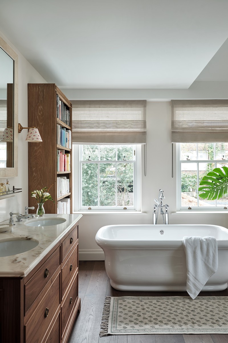
WALL PAINT: Edward Bulmer Paint
SHEER BLIND FABRIC: Holly Hunt
BATH: The Water Monopoly
WALL LIGHTS: Pooky
BOOKCASES: OKA
MIRROR: Client’s own
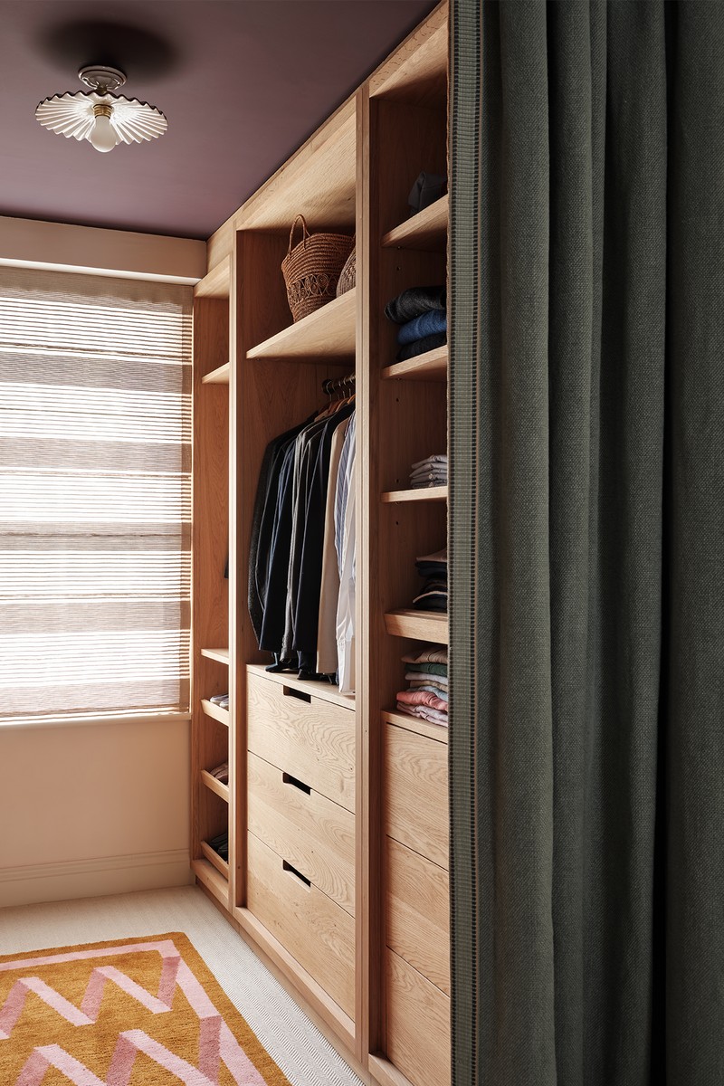
The Dressing Room
While the adjacent spaces are fresh and light, we added the contrast ceiling colour in here to create an unexpected, moody and cocooning feel. To maximise space within the dressing room, we omitted the joinery doors and added a heavy, lined linen curtain to the entrance of the space instead.
CEILING: Farrow & Ball
CEILING LIGHT: Artemest
RUG: Nordic Knots
CURTAIN FABRIC: Rose Uniacke
The Guest Bedroom
The multifunctional purpose of this space meant keeping to a neutral palette, but one with warmth and character.
WALLS: Farrow & Ball
BESPOKE HEADBOARD & VALANCE FABRIC: Howe
WALL LIGHT: Visual Comfort
CUSHIONS: The Trove
BEDSIDE TABLE: Client’s own
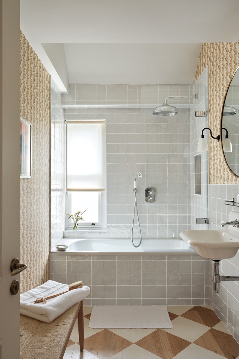
The Guest Bathroom
It was important that this bathroom felt welcoming; the wallpaper and painted floorboards in a diamond pattern really help to achieve this.
WALLPAPER: Soane
BENCH: Neptune
TILES: Original Style
SINK: Burlington Bathroom
WALL LIGHTS: Old School Electric
SHELF: Rowen And Wren
MIRROR: Client’s own
/https%3A%2F%2Fsw18.sheerluxe.com%2Fsites%2Fslman%2Ffiles%2Farticles%2F2024%2F01%2Ffam-bath.png)
The Family Bathroom
We introduced tongue-and-groove panelling and chequerboard tiles to create visual impact within a small space. The tonal colour palette helps to unify and balance the overall look and feel.
TILES: OttoTiles Daphne & Otto Tiles Navy
PANELLING COLOUR: Coat Paints
WALL LIGHTS: Pooky
WALL LIGHT SHADE: Pooky
BASIN: Burlington Bathrooms
SHELF: Rowen And Wren
MIRROR: Antique
Visit Kitesgrove.com
Photographer: Astrid Templier
All products on this page have been selected by our editorial team, however we may make commission on some products.
DISCLAIMER: We endeavour to always credit the correct original source of every image we use. If you think a credit may be incorrect, please contact us at [email protected].
/https%3A%2F%2Fsw18.sheerluxe.com%2Fsites%2Fslman%2Ffiles%2Fwebsite-images%2F2024%2F06%2Fmaiya03-1.jpg)